Food packaging conveys a message from the food manufacturer to customers. Packaging design, company logos, and colours are all part of the visuals helping elevate a brand. That, however, is only part of the story.
“Before you even start, you need to think about your strategy, not just packaging and design. We work with the four truths—what is your category, who is your customer, what is happening in the culture, and what is your product about,” says Elyse Boulet, CEO and managing partner at award-winning agency Pigeon. Started in 1971, Pigeon, which has offices in Toronto, Montreal, and Mexico City, has helped build over 1000 brands.
“Designing a package can easily take more than a year,” says Boulet.
She gives food manufacturers this advice.
“Never look at packaging design against a white paper. It needs to be viewed both online and in-store to see not only how it will really look, but how it looks next to the competition,” she explains. “This will depend on where your product will be displayed. If you have a frozen dessert, you need to see how the packaging will look behind glass.”
The moment of truth comes when shoppers reach the grocery aisle.
“Any designer can create something beautiful, but the key is to create something beautiful that sells products,” she says.
Simplicity wins
Pigeon works on the premise of findability, stopability, shopability, and usability. The product must be findable among masses, with easy brand recognition. It must stop shoppers and grab their attention. Shopability is all about storytelling. It helps consumers understand the product, the offer, and benefits. The useability of the food product must be clear and housed in a highly functional package.
Recently, Pigeon worked with rice company Dainty.
“In a category where giants are expanding their offerings and private brands are becoming more popular, the Dainty brand had lost its momentum. With obsolete packaging and inactive communication for several years, the brand equity had become very low. With a generous product line and know-how passed down from generation to generation, the brand was in dire need of revitalization in every way,” says Boulet.
The packaging was taken from a flat pillow style, common among rice manufacturers, to stand-up packaging in a vivid teal colour. Dainty’s premium tier rice has black packaging, while the organic is green. A new, large, curvy white font identifies the brand name. Dainty’s brand icon in regal gold sits above, with the date 1882, the year the company was founded.
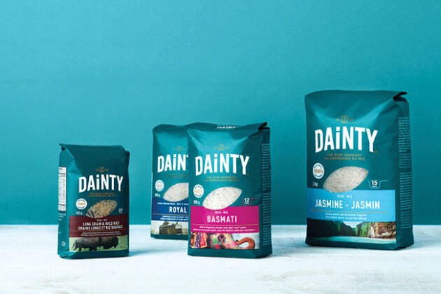
Pigeon helped redesign rice brand Dainty’s packaging. The rice is now packaged in stand-up pouches in vivid colours and has a window to show the product inside. Photo © Pigeon
A small window in the packaging reveals the rice. Next to this is the time symbol telling consumers how long it takes to cook. The colourful flavour band below indicates the type of rice, while the photo below the band gives a visual on the country of origin. The band is hot pink for Dainty’s basmati rice, and the photo image is a celebratory painted elephant.
As for some general trends in food packaging, Boulet says, “Simplification. Packaging needs to be simple to understand. You only have three seconds to capture the customer’s attention. Bigger brand marks are integrated into the packaging to be instantly recognizable. Also, you can’t say everything on the brand packaging. That is why QR codes are so popular for looking up additional product information and recipes.”
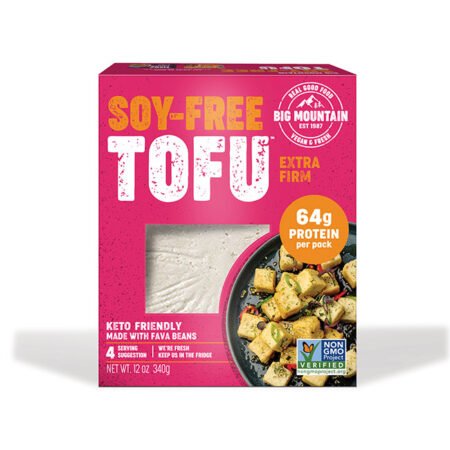
Big Mountain Foods is known for using bold and bright colours like hot pink in its packaging. Photo © Big Mountain Foods
Bold and bright
“Colour has always been a big part of how we position the Big Mountain brand,” says Jasmine Byrne, COO of Big Mountain Foods in Vancouver. The company pioneered the first-ever soy-free tofu made with fava beans. Packaging colours for various products include sunflower yellow, deep purple, lime green, and hot pink.
“We are innovating the space with the food of the future, and we aren’t afraid of showing this off,” says Byrne. “Our bold and bright colours align with our vision—we’re bold and unafraid. We stand out on shelves and are creating foods that should stand out as key players in the growing shift towards real food made with real ingredients.”
As Big Mountain Foods evolved its marketing strategies, new packaging was needed.
“Today, people want to see what they’re going to eat. Consumers are being drawn towards food brands they can trust,” says Nicole Duff, creative co-ordinator. “This is why we integrated windows into our new soy-free tofu packaging.”
Adjustments had to be made to the packaging design to accommodate the window.
“This presented a challenge, as we wanted to make sure this box was cohesive as a part of the Big Mountain family, fitting our text, logo, and other elements while accommodating this new window,” says Duff. “Our strategy was, and always has been, to put our bold imagery, colour palette, and recognizable design first—and build other elements around it in a supporting manner.”
Then Duff adds, “For this line, we chose to integrate visuals that tell the story of our fava beans since we are so proud of the whole journey. This begins with fava beans that are grown on a women-owned, Canadian, and regenerative farm to our soy-free tofu, and then to the life after production where we upcycle tofu byproducts and underweight tofu to ensure nothing is ever wasted.”
Duff offers packaging advice to other food manufacturers.
“Understand packaging regulations in the countries you are distributing to. Packaging regulations can vary by country and type of product, so it is important to ensure you understand what rules must be followed before getting too far into any design.”
Then Duff adds, “Sustainability and environmental consciousness are in. We are seeing a shift to more sustainable materials and a reduction in unnecessary packaging. This can mean getting creative with packaging and being more conscious of the materials used to make products functional and attractive on shelf.”
Food packaging helps to elevate a brand and build a loyal customer base. Developing packaging takes time and requires well thought-out strategies. Seeing more of your products ringing through the cash register is worth the time and effort.
This article was originally published in the Oct. 2024 issue of Food in Canada.
- Source: https://www.foodincanada.com/features/the-art-of-food-packaging-strategies-for-brand-success/