The right wall colors can completely change the feeling of a home. A simple hall can become a warm, welcoming space, a narrow entryway can feel brighter and more open, and an ordinary living area can look elegant without expensive furniture or major renovations. Sometimes, all it takes is two carefully chosen shades to create a beautiful transformation.
Choosing the perfect colors, however, can feel confusing. Should the walls be cream and white, beige and brown, or perhaps a little more adventurous with sage green and warm gray? The answer depends on the size of the room, the amount of natural light, the furniture, and the atmosphere you want to create.
These 12 hall colour combination ideas offer inspiration for different tastes, from timeless neutral interiors to bold, modern spaces. Each pairing brings its own personality, helping you create a hall that feels comfortable, stylish, and connected to the rest of your home. Even better, many of these combinations work beautifully with simple furniture and affordable decorative accessories.
Cream and White for a Bright and Elegant Hall
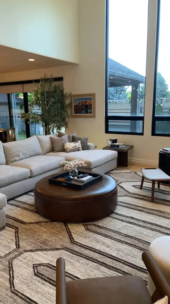
Cream and white create a timeless color combination that makes almost any hall feel fresh, peaceful, and inviting. White reflects light beautifully, while cream adds warmth that prevents the room from feeling too cold or plain. Together, these shades create an elegant backdrop for traditional and contemporary interiors.
This combination works particularly well in small halls, apartments, and homes with limited natural light. The lighter walls help the space feel more open, while subtle differences between the two shades add depth without overwhelming the room. For a balanced appearance, use warm white on the main walls and introduce cream on an accent wall, around an archway, or along decorative molding. Wooden furniture, beige curtains, and natural woven baskets complement the palette beautifully.
Gold or brass lighting fixtures can add a sophisticated finishing touch. If you prefer a simpler look, black picture frames and minimal decorations create a modern contrast. One helpful detail is to choose whites with similar undertones. A warm cream can look slightly yellow beside a cool, blue-toned white, so testing paint samples together can help you avoid an unexpected clash.
Best for: Small halls, classic interiors, minimalist homes, and spaces that need a brighter appearance.
Beige and Brown for a Warm and Cozy Atmosphere
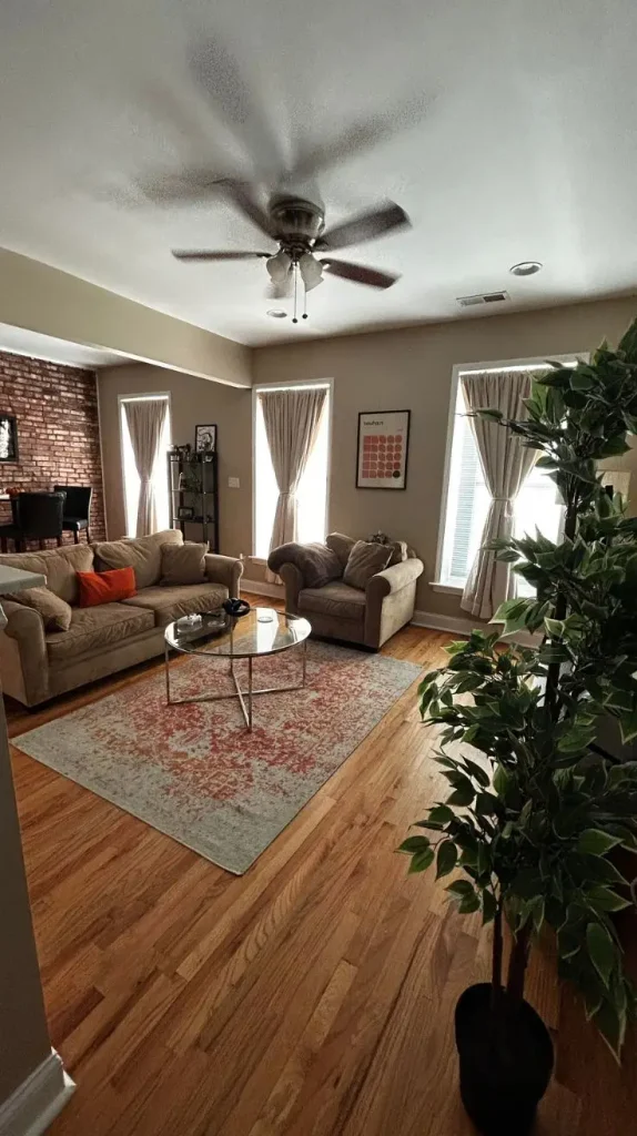
Few color combinations feel as comfortable and welcoming as beige and brown. These earthy shades bring a natural warmth to the home, creating a hall that feels relaxed rather than overly formal. They also work well with many furniture styles, making them a practical choice for homeowners who want a beautiful interior that remains appealing for years.
Beige provides a soft background, while brown adds richness and definition. You can paint the main walls in light beige and introduce deeper brown through an accent wall, wooden wall panels, or decorative features. For a modern appearance, choose sandy beige with walnut brown. If you enjoy a more luxurious atmosphere, combine creamy beige with espresso brown and warm metallic accents.
Furniture plays an important role in completing this look. A wooden console table, a large framed mirror, and a textured runner can make the entrance feel thoughtfully decorated. Soft lighting from wall sconces or a pendant fixture enhances the warmth of the colors. Avoid using dark brown on every wall in a narrow hallway, as it may make the space feel enclosed. Instead, reserve the deeper shade for one area and allow lighter colors to keep the room visually open.
Best for: Cozy family homes, rustic interiors, traditional houses, and warm modern spaces.
Sage Green and White for a Fresh Natural Look
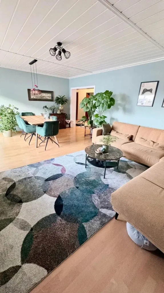
Sage green has become a favorite for interiors because it brings a gentle connection to nature without the intensity of brighter greens. When paired with white, it creates a calm and refreshing hall that feels clean, modern, and full of character.
The beauty of this combination lies in its softness. Sage green introduces color without dominating the room, while white balances the look and helps the space feel light. This makes the pairing suitable for homeowners who want something more interesting than an entirely neutral interior.
One lovely approach is to paint the lower half of the walls sage green and keep the upper half white. A narrow trim or simple wall molding between the two colors creates a polished appearance. Alternatively, a single sage accent wall behind a console table can provide a subtle focal point.
Natural materials complement this palette especially well. Think light oak furniture, linen curtains, woven storage baskets, and ceramic planters. A few leafy indoor plants can strengthen the connection to nature.
For a slightly more sophisticated finish, introduce muted gold hardware or charcoal picture frames. These small details prevent the design from looking too plain while maintaining its peaceful atmosphere. Sage green also works beautifully with warm lighting. Under very cool lighting, some shades can appear gray, so check your paint sample in both daylight and evening light before making a final decision.
Best for: Nature-inspired homes, contemporary interiors, Scandinavian decor, and peaceful family spaces.
Gray and White for a Clean Modern Hall
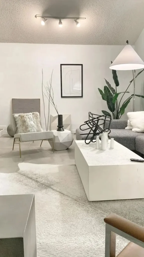
Gray and white offer a clean, organized appearance that suits modern homes. Gray introduces a little depth, while white keeps the overall design fresh and balanced. Depending on the shades you select, this combination can feel soft and welcoming or sleek and sophisticated.
Light gray walls work particularly well in narrow halls because they provide more visual interest than plain white without making the room feel too dark. White ceilings, door frames, and trim help define the architecture and create a crisp finish.
For a contemporary style, combine pale gray with bright white and introduce black accents through picture frames, lighting fixtures, or furniture legs. If you prefer a softer atmosphere, choose warm gray with creamy white instead. A slim console table can provide a practical place for keys and everyday essentials. Add a round mirror above it to reflect light and create a sense of space. A simple rug with gray and ivory patterns ties the colors together.
However, gray can sometimes feel cold when used with cool white and harsh lighting. Warm wood, textured fabrics, and soft yellow-toned bulbs help bring balance to the design. This is one of the most flexible color pairings because it works with many furniture finishes and decorative styles. You can also update the appearance seasonally with cushions, artwork, flowers, or other accessories without repainting the walls.
Best for: Modern apartments, minimalist homes, contemporary interiors, and understated elegance.
Navy Blue and Cream for a Sophisticated Hall
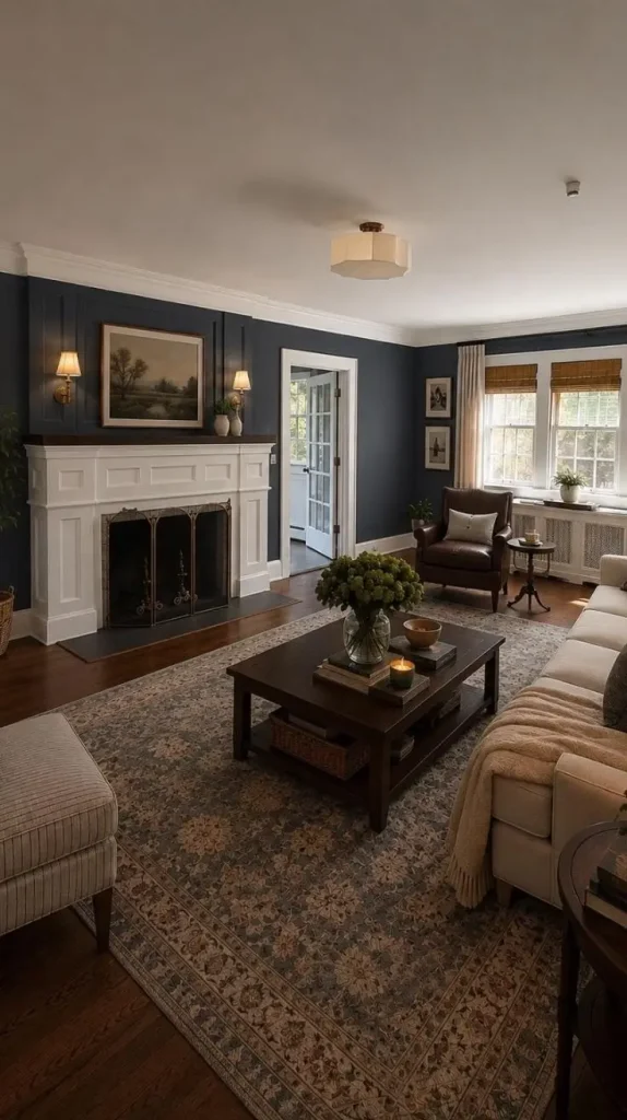
Navy blue and cream create a striking combination that feels both sophisticated and welcoming. Navy brings depth and confidence to the interior, while cream softens its intensity. The result is a hall with personality that still feels timeless.
This pairing works especially well when you want the entrance to make a memorable first impression. A navy accent wall behind a mirror or console table creates a strong focal point without requiring elaborate decorations. Cream-colored walls on the remaining sides help balance the darker shade. If your hall is large or receives plenty of natural light, you may also consider using navy across a larger wall area. In a narrow or dim hallway, a smaller navy feature is usually the safer choice.
Brass or gold details look beautiful against navy. Consider a gold-framed mirror, warm metal wall sconces, or a decorative bowl on the console table. Light wood and cream upholstery can soften the overall appearance. For artwork, choose simple botanical prints, abstract designs, or photographs with white backgrounds. These pieces stand out nicely against the deep blue wall. The key is to let navy act as the statement color rather than covering every surface with dark tones. When balanced carefully, this combination creates a luxurious atmosphere without making the hall feel overly formal.
Best for: Elegant homes, classic interiors, transitional decor, and statement-making entrances.
Terracotta and Beige for an Earthy, Welcoming Hall
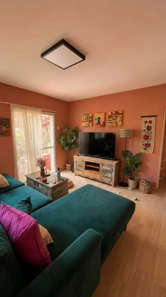
Terracotta brings the warmth of sunbaked clay into the home. Paired with beige, it creates an earthy color scheme that feels inviting, relaxed, and full of character. This combination is especially appealing for people who love Mediterranean interiors, rustic decor, or natural materials.
The reddish-orange undertones of terracotta add richness to the walls, while beige keeps the space from feeling too intense. You can introduce terracotta on one accent wall and use sandy beige throughout the rest of the hall.
Another attractive approach is to use muted terracotta below a chair rail and creamy beige above it. This arrangement adds visual interest and can make a plain hallway feel more thoughtfully designed. Natural wood, rattan, clay pottery, and woven baskets work beautifully with these colors. A large mirror with a wooden or antique-style frame can also add character without overcrowding the space.
Lighting matters because terracotta changes noticeably throughout the day. In warm evening light, it can appear richer and more reddish, while bright daylight may reveal softer orange or pink undertones. Testing paint samples in your actual hallway helps you select a shade that suits the surroundings. For a modern finish, keep the furniture simple and use only a few decorative pieces. For a more rustic look, incorporate textured wall finishes and handcrafted accessories.
Best for: Mediterranean homes, bohemian interiors, rustic spaces, and warm, welcoming entrances.
Blush Pink and White for a Soft, Stylish Hall
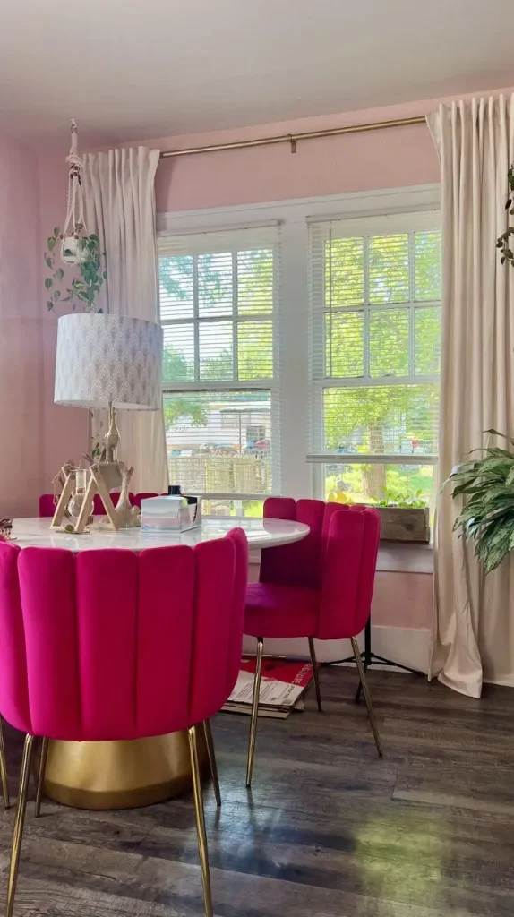
Blush pink and white create a gentle, stylish atmosphere without making the hall feel overly colorful. The secret is choosing a muted pink with soft beige or dusty undertones rather than a bright, saturated shade. White provides freshness and balance, while blush pink introduces warmth and personality. Together, they can make an entrance feel graceful, cheerful, and surprisingly modern.
For a subtle design, paint the main walls white and use blush pink on a feature wall or within decorative wall molding. You could also reverse the arrangement by using pale pink throughout the hall and keeping the ceiling, trim, and doors white. Light oak furniture complements this palette particularly well. Add a round mirror, a cream-colored runner, and a simple vase filled with fresh flowers for a polished appearance.
If you want a more contemporary style, combine blush pink with black accents or brushed brass fixtures. These contrasting details give the soft colors a little more definition. Avoid pairing too many competing pink shades in one small space. A restrained palette usually creates a more elegant result. It is also worth checking the pink paint under different lighting conditions, as some shades can appear peachy during the day and more lavender in cooler light.
Best for: Contemporary homes, feminine interiors, apartments, and soft minimalist decor.
Olive Green and Beige for a Rich Natural Interior
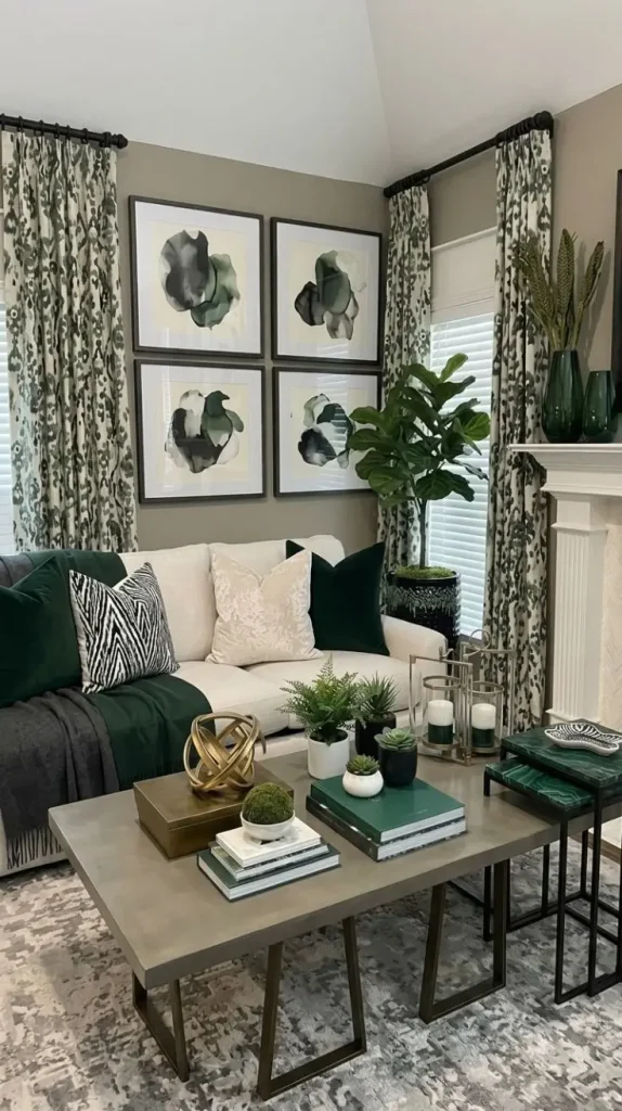
Olive green offers a deeper, more grounded alternative to sage green. Its earthy undertones create a rich atmosphere, while beige provides the lightness needed to keep the hall balanced. This combination suits homeowners who enjoy natural colors but want something with a little more depth. Olive green can feel sophisticated, traditional, or modern depending on the furniture and accessories you choose.
A particularly attractive design uses olive green on one main wall and warm beige on the remaining surfaces. The green wall becomes a natural backdrop for artwork, a mirror, or a wooden console table. Choose beige with warm undertones to complement the green. Natural oak, walnut, leather, linen, and woven materials fit beautifully into this palette. You can also introduce small touches of black or aged brass for added definition.
If the hallway receives limited daylight, consider a lighter olive shade rather than a very dark forest-like green. A pale ceiling and good lighting will help preserve a comfortable sense of space. This pairing is also easy to update. Neutral rugs, simple artwork, and seasonal branches or flowers can change the atmosphere without competing with the walls.
Best for: Earthy interiors, modern rustic homes, traditional houses, and nature-inspired decor.
Charcoal Gray and White for a Bold Contemporary Hall

Charcoal gray and white create a dramatic contrast that can give a plain hall a striking architectural appearance. Charcoal introduces depth, while white keeps the design crisp and prevents the darker color from overwhelming the space. This combination works particularly well in contemporary homes with clean lines, simple furniture, and minimal decoration. A charcoal accent wall can turn an ordinary hallway into a memorable feature of the interior.
For a balanced design, use charcoal behind a console table, on a section of wall near the entrance, or around a recessed architectural feature. Keep adjacent walls white to maintain brightness. A large mirror can help reflect available light, while pale flooring and white ceilings provide additional visual balance. Black metal lighting fixtures and understated artwork reinforce the contemporary style.
In a larger hall, charcoal can work across more than one wall, especially when natural light is plentiful. In a small or narrow hallway, limiting the dark shade to one area generally creates a more comfortable result. Texture is particularly useful with this palette. A subtle plaster finish, vertical wall panels, or simple molding can keep the dark wall from appearing flat. For a warmer interpretation, introduce a wooden bench, a light oak console table, or a beige runner. These elements soften the strong contrast and make the entrance feel less formal.
Best for: Contemporary houses, minimalist spaces, industrial-inspired interiors, and bold accent walls.
Mustard Yellow and White for a Cheerful Hall

Mustard yellow and white create an energetic color combination that can make a hall feel brighter and more welcoming. Yellow brings warmth and cheerfulness, while white prevents the stronger shade from becoming overwhelming. This pairing is ideal for people who want to introduce color without covering their home in bold patterns or complicated decorations. A muted mustard shade feels rich and grounded, whereas a lighter golden yellow creates a softer, sunnier appearance.
For a simple design, use white on most walls and introduce mustard on one accent wall. You can also use the yellow shade on the lower portion of the walls, with white above it, to create a distinctive two-tone effect. Wooden furniture complements mustard beautifully. A natural wood console, a woven basket, and a neutral runner help balance the brightness. Green plants also look attractive against yellow walls, adding a fresh natural contrast.
Keep the remaining accessories relatively simple. Too many bright colors can make a small hall feel visually busy, so allow mustard to remain the main feature. The right shade makes a significant difference. A deep mustard can feel cozy and traditional, while a lighter golden yellow feels more playful and relaxed. Testing a sample is particularly helpful because yellow paint often looks much brighter on a large wall than it does on a small color card.
Best for: Cheerful family homes, eclectic interiors, welcoming entrances, and spaces that need warmth.
Teal and Light Gray for a Stylish Modern Hall
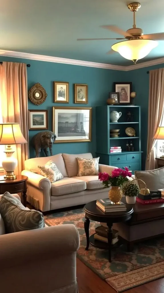
Teal combines the richness of blue with the freshness of green, creating a distinctive color that feels both lively and sophisticated. When paired with light gray, it becomes a stylish choice for a modern hall. The contrast between these shades creates depth without relying on very dark black or brown tones. Teal provides the focal point, while light gray softens the overall appearance and allows the room to feel balanced.
A deep teal accent wall works beautifully behind a console table or a large piece of artwork. Keep the other walls light gray and use white for the ceiling and trim to maintain a bright, clean finish. For furniture, consider pale wood, simple black metal, or furniture upholstered in soft gray fabric. Metallic details in brushed brass or silver can complement the colors, depending on whether you prefer a warmer or cooler finish.
Artwork can introduce additional personality. Abstract prints with white, blue, and muted green tones tie the palette together without making the room feel cluttered. Because deep teal can absorb light, it is important to consider the hallway’s size and brightness. In a narrow space, a muted or medium teal may be more suitable than a very dark shade.
Best for: Modern apartments, creative interiors, contemporary homes, and colorful accent walls.
Lavender and Warm White for a Calm, Elegant Hall
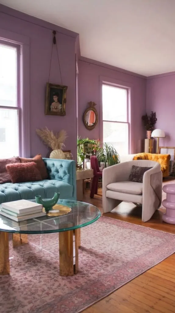
Lavender and warm white offer a softer alternative to traditional neutral color schemes. Lavender introduces a delicate hint of purple, while warm white keeps the interior light and comfortable. The combination can feel graceful, peaceful, and subtly distinctive. The best results usually come from choosing a muted lavender rather than an intense purple. Soft shades with gray undertones tend to look more refined and blend easily with modern furniture.
Paint the main walls warm white and use lavender as an accent. Another option is to create a two-tone wall with lavender below and white above, separated by a simple trim detail. This arrangement adds character without requiring elaborate decoration. Light wood furniture, cream rugs, and understated artwork complement the palette. Silver accents can create a cool, elegant finish, while pale gold and brass bring additional warmth.
Lighting deserves special attention because purple-based colors can change significantly throughout the day. A lavender shade may appear cooler in north-facing rooms and warmer under yellow-toned bulbs. Testing the paint on different walls will help you find the right balance. For a polished appearance, repeat the lavender shade in one or two accessories, such as a decorative vase or a piece of artwork. This small connection helps the space feel coordinated without making the color scheme repetitive.
Best for: Soft contemporary interiors, elegant apartments, minimalist homes, and peaceful entryways.