Summary:
Premium packaging isn’t a design choice, it’s an engineering outcome. Behind every luxury unboxing experience are six physical levers, from rigid board construction to monomaterial sustainability, that separate high-end packaging from packaging that only looks premium on paper.
Many brands invest heavily in luxury graphic design, only to print it onto a substrate with noticeable paper grain or weak structural integrity. Graphic design alone can’t produce that kind of premium feel. It takes structural engineering, material science, and manufacturing tolerances working together to get there. Drawing on real-world engineering case studies like T3 Micro, A Week in Puglia, BIGFACE, and Flaviar, here is how luxury packaging is actually built.
A box’s weight creates a customer’s first impression. Before they even lift the lid, the heft and rigidity in their hands signal that the contents inside are valuable.
Most everyday products ship in folding cartons instead, a single layer of 12pt to 24pt paperboard, die-cut and glued. While economical, thin cartons flex under light pressure and feel hollow, letting the packaging’s flimsiness undermine the product inside.
A rigid grayboard core solves that problem at the material level. Dense, 1.5mm to 2.5mm thick, and wrapped in high-grade 128gsm art paper or specialty tissue, it doesn’t flex the way standard cartons do. That density is what tells a customer’s hand this is something worth valuing, before they’ve even seen what’s inside.
Weight only gets a box halfway to feeling premium. Grain direction finishes the job. Paper fibers align in one direction during production, and folding against that grain forces the fibers to snap rather than bend cleanly, creating unsightly micro-fractures along the folded edges.
Dark-printed and foiled boxes show this damage worst of all. The cracks peel open and raw white fiber shows through underneath, so a box that just came off the line already looks beaten up. Packaging engineers prevent this by mapping the paper grain parallel to the main score lines, keeping every corner razor-sharp with zero ink cracking.
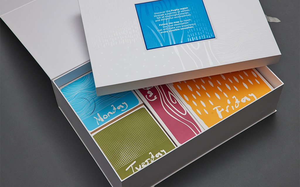
When the Puglia Regional Tourism Board created a luxury media kit, they faced an immense structural challenge: safely shipping heavy wine bottles, olive oil, delicate ceramics, and an embedded LCD video screen in a single package. Zenpack built a seven-component rigid box ecosystem, wrapped in custom four-sided sleeves with precise grain alignment, letting the full-coverage Italian artwork wrap around tight corners without cracking. The kit passed ISTA drop testing with no bulging or bowing, and journalists felt that same substantial weight the moment they picked it up.
Does Your Packaging Make the Right First Impression, On Screen and In Hand?
Visual presence stops the scroll. Tactile presence is what convinces someone the product is worth its price.
Influencer unboxings put boxes inches from high-definition lenses and directional microphones, fingernails dragging across surfaces, matte finishes getting stroked, every rustle and snap recorded for ASMR appeal. A hollow-sounding lid or a coating that scuffs under a thumbnail shows up on camera immediately.
Reflective paper blows out into harsh glare under studio lighting and phone cameras, washing out the artwork underneath. Applying an anti-scuff matte polypropylene (PP) film solves the glare problem. The matte film diffuses harsh studio glare to keep digital artwork crisp on screen, provides a velvety hand-feel, and protects delicate reflective papers from chalky finger scratches.
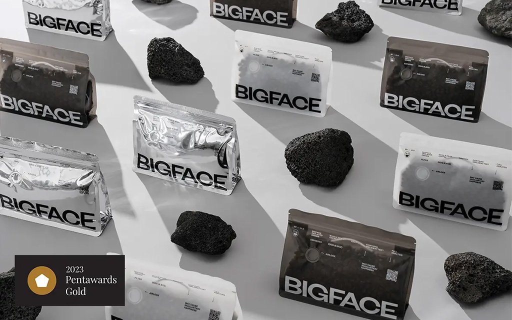
BIGFACE Coffee’s design called for a raised, dimensional embossment across the outer box. Zenpack’s fix was to fill the recessed side with paper pulp, a technique borrowed from puff embroidery, locking the raised areas permanently in place. A matte PP film was applied to the surface to soften the visual weight of an oversized box, while anti-scuff coating kept the mirrored paper scratch-free through handling and shipping. The result survived exactly what unboxing culture throws at packaging: constant handling, close-up lenses, and a finish that never degraded.
Does the Unboxing Moment Sound as Premium as It Looks?
The tear strip is usually the first thing a customer’s hands actually touch. Zenpack engineers custom cardboard zipper strips built for one continuous rip, no snags, no jagged edges, just a clean sound that holds up on camera.

BIGFACE Coffee took the concept further. Zenpack developed a tamper-evident security sticker that doubles as a roast-date display, refined through multiple iterations until the tear delivered exactly the resistance ASMR audiences look for. A small design choice, but it turns a security feature into a moment customers actually want to film.
A magnet closure does its own kind of work. Opening a box equipped with premium-grade magnets delivers a heavy, resonant click akin to a luxury car door shutting. Nobody designs that sound by accident. Magnet strength, surface clearance, recessing depth, every variable is tuned until the click lands right.
Can Your Packaging Protect, Present, and Release the Product All at Once?
Interior inserts must accomplish three competing goals simultaneously. Lock the product in place for transit safety. Present it well for visual impact when the box opens. Let the customer pull it out without a fight or a tear.
EVA foam has been the default for high-end sampling sets, advent calendars, and gift boxes for cosmetics, spirits, or wellness products. It molds into any shape, holds fragile items in place, and adds a sense of luxury heft that brands have long relied on.
The downside reveals itself in the supply chain: foam does not compress. A pallet of pre-molded foam inserts takes up the same warehouse volume whether empty or filled with product—forcing brands to pay full freight, storage, and handling rates for trapped air.
Flaviar dropped the foam entirely. Working with Zenpack, their spirits sets now run on a 100% recyclable, multi-layer die-cut paperboard structure. Each layer is engineered with precision keyhole contours cut to the exact diameter of individual glass tasting bottles.
The real win shows up in the warehouse. Because the paper inserts fold flat and snap together during assembly, Zenpack helped Flaviar cut shipping costs by up to 60%. Packing got simpler too. One person can now assemble and close out an order in minutes.
Can Your Packaging Look Exactly the Same on Batch 1 and Batch 5,000?
A batch that runs slightly more humid than usual. Glue mixed a touch thick. A dye lot that’s just a shade off from the last one. None of that shows up on a spec sheet, but it shows up the second two boxes sit side by side, on a shelf or in an unboxing video.
Luxury hair tech brand T3 ran into this problem at scale, across a wide range of hair tool SKUs. Packaging came from multiple paper vendors with no unified system, so print colors drifted, paper quality varied box to box, and the gold foil logo didn’t always print correctly. Zenpack fixed this by codifying a unified development-to-mass-production SOP governing every stage from design file to shipping container.
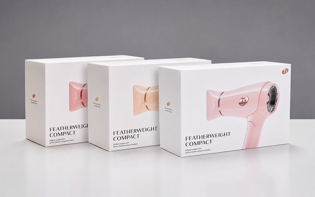
Pre-production design guardrails start the process, matching digital files to what the factory press can actually reproduce. To lock in color accuracy, Zenpack tested nine shades of red against T3’s signature red hair dryer until the packaging matched exactly. The gold foil logo now prints correctly every time using a custom-calibrated jig that holds each unit in the same position during stamping.
From there, limit samples take over. Mechanical variables make slight batch-to-batch shifts unavoidable, so instead of relying on someone’s eye, procurement teams use physical limit samples that mathematically define the lightest and darkest acceptable shade allowed on the line. A pre-shipment inspection protocol enforces strict quality checks before goods leave the factory, confirming that corner wrapping, glue dispensing, and structural integrity all match the golden sample, the one physical unit both brand and factory sign off on as the standard.
Consolidating paper vendors and standardizing dielines on top of this system also cut T3’s labor costs by 30 percent. Consistency and cost savings, it turns out, don’t have to pull in opposite directions.
Does Your Packaging’s Sustainability Story Actually Hold Up Under Scrutiny?
Magnets deliver a satisfying acoustic close, but for brands chasing full recyclability, even a small embedded magnet forces the entire box into mixed-material disposal. Monomaterial rigid packaging solves that by replacing the typical multi-material box with a single 100% paperboard construction. Paper-locking tabs take over the closure function instead, keeping the structure fully recyclable while still closing with the same satisfying feel.
Soy and vegetable-based inks, paired with water-based varnishes, deliver the deep blacks and high-gloss finishes brands expect from petroleum-derived coatings, without leaving behind a residue that blocks repulping.
Post-consumer waste (PCW) papers round out this material shift. Using a high percentage of PCW content used to mean sacrificing burst strength or ending up with a rough, uneven print surface, but current PCW engineering holds up on both fronts, delivering structural durability and a smooth surface that takes ink and foil just as cleanly as virgin paper.
So, Where Does Your Packaging Actually Stand?
At the end of the day, luxury perception isn’t built in a design mockup; it’s engineered on the factory floor. T3, Puglia, BIGFACE, and Flaviar didn’t elevate their packaging by simply tweaking colors or logos. They dialed in tolerances, standardized their supply chains, and respected the physics of the unboxing experience.
Most brands never get a clear answer on where their own packaging falls on that spectrum. Zenpack’s Premium Packaging Scorecard gives you a baseline. In under five minutes, this free assessment evaluates your packaging across the same six dimensions covered here, and places your results into one of four categories, from Premium Leading to At Risk.
Take the Premium Packaging Score today, and find out whether your packaging is building your brand’s value or quietly working against it.
The post Deconstructing the Engineering Behind Premium Packaging appeared first on Zenpack Blog.