How Many Countries Fit in Africa The Continent’s True Size
This was originally posted on our Voronoi app. Download the app for free on iOS or Android and discover incredible data-driven charts from a variety of trusted sources.
Key Takeaways
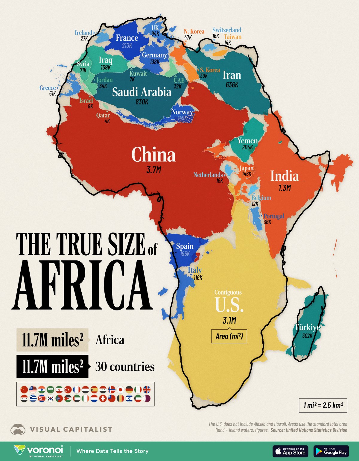
- The continent of Africa covers 11.7 million mi² (30.4 million km²), roughly equal to the size of 30 countries.
- These 30 include some of the world’s largest countries like the (contiguous) U.S., China, and India.
- However, the most common map projection, called the Mercator projection, makes Africa it appear smaller than actually is.
- The African Union has urged governments to not use it anymore as it gives the impression that Africa is “marginal” on the world stage.
- For reference, Africa is the second-largest continent, both by size and population (1.6 billion people).
Africa is vast.
So vast that its full scale can be hard to grasp by looking at most world maps.
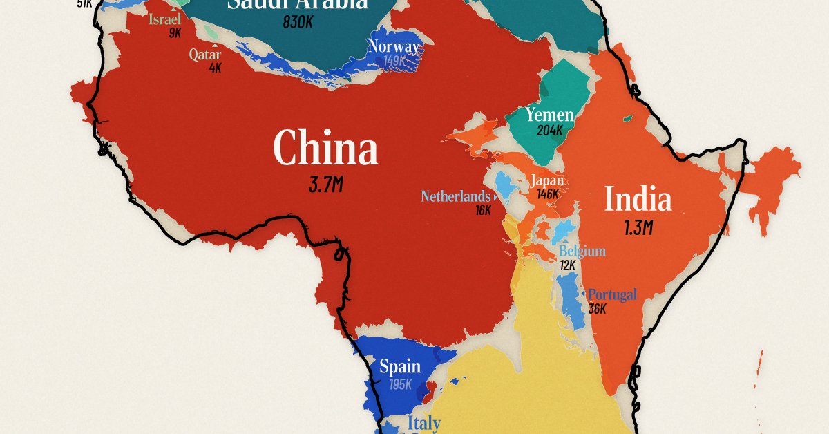
The graphic above solves this by combining individual countries inside the continent’s area, showing that Africa’s landmass is on par with the (contiguous) U.S., China, India, and much of Western Europe combined.
Data for this visualization comes from UN Statistics Division and total area (land + inland waters) was used for this comparison.
Africa’s Area in Raw Numbers
At 11.7 million mi² (30.4 million km²), Africa is the world’s second-largest continent after Asia.
Put another way, it easily contains the contiguous U.S. (3.1M mi² / 8.1M km²) and China (3.7M mi² / 9.6M km² ) with room to spare.
| Country/Region | Total Area (mi²) | Readable Label | Total Area (km²) | Readable Label |
|---|---|---|---|---|
 Contiguous U.S. Contiguous U.S. |
3,119,885 | 3.1M miles² | 8,080,464 | 8.1M km² |
 China China |
3,705,407 | 3.7M miles² | 9,596,961 | 9.6M km² |
 India India |
1,269,219 | 1.3M miles² | 3,287,263 | 3.3M km² |
 Saudi Arabia Saudi Arabia |
830,000 | 830K miles² | 2,149,690 | 2.1M km² |
 Iran Iran |
636,372 | 636K miles² | 1,648,195 | 1.6M km² |
 Turkey Turkey |
302,455 | 302K miles² | 783,356 | 783K km² |
 France France |
213,011 | 213K miles² | 551,695 | 552K km² |
 Yemen Yemen |
203,850 | 204K miles² | 527,968 | 528K km² |
 Spain Spain |
195,364 | 195K miles² | 505,990 | 506K km² |
 Iraq Iraq |
169,235 | 169K miles² | 438,317 | 438K km² |
 Norway Norway |
148,729 | 149K miles² | 385,207 | 385K km² |
 Japan Japan |
145,937 | 146K miles² | 377,975 | 378K km² |
 Germany Germany |
137,988 | 138K miles² | 357,386 | 357K km² |
 Italy Italy |
116,348 | 116K miles² | 301,340 | 301K km² |
 UK UK |
93,628 | 94K miles² | 242,495 | 242K km² |
 Syria Syria |
71,498 | 71K miles² | 185,180 | 185K km² |
 Greece Greece |
50,949 | 51K miles² | 131,957 | 132K km² |
 North Korea North Korea |
46,541 | 47K miles² | 120,540 | 121K km² |
 South Korea South Korea |
38,750 | 39K miles² | 100,363 | 100K km² |
 Portugal Portugal |
35,603 | 36K miles² | 92,212 | 92K km² |
 Jordan Jordan |
34,495 | 34K miles² | 89,342 | 89K km² |
 UAE UAE |
32,278 | 32K miles² | 83,600 | 84K km² |
 Ireland Ireland |
27,133 | 27K miles² | 70,273 | 70K km² |
 Netherlands Netherlands |
16,164 | 16K miles² | 41,865 | 42K km² |
 Switzerland Switzerland |
15,942 | 16K miles² | 41,290 | 41K km² |
 Taiwan Taiwan |
13,976 | 14K miles² | 36,197 | 36K km² |
 Belgium Belgium |
11,849 | 12K miles² | 30,689 | 31K km² |
 Israel Israel |
8,522 | 9K miles² | 22072 | 22K km² |
 Kuwait Kuwait |
6,880 | 7K miles² | 17818 | 18K km² |
 Qatar Qatar |
4,473 | 4K miles² | 11586 | 12K km² |
 30 Countries 30 Countries |
11,702,481 | 11.7M miles² | 30309286 | 30.3M km² |
 Africa Africa |
11,730,000 | 11.7M miles² | 30370000 | 30.4M km² |
Add India’s 1.3M mi² (3.3M km²) and we’re still not close to filling the continent’s footprint.
In fact, it takes a total of 30 countries together—shown in the graphic above —to equal Africa’s total area, underscoring how massive the continent is in absolute terms.
Of course, country selection can change these numbers. If prioritizing Central and South American countries instead (like Mexico and Argentina,) the comparison could reduce to 18 entities.
Including Alaska and Hawaii would increase America’s footprint by 700,000 mi² (1.8M km²).
Why Your Wall Map Gets Africa Wrong
Many of us grew up looking at wall maps that use the Mercator projection.
This 16th-century design keeps straight lines for navigation but dramatically enlarges regions near the poles and compresses those near the equator.
Africa, which straddles the equator, is one of the biggest victims of this distortion.
That discrepancy fuels common misconceptions about just how expansive Africa really is.
African Union Calls For Equal Projections Map
The African Union has asked international organizations to stop using the Mercator projection.
They say this size misrepresentation undermines the perceived global influence and importance of Africa and perpetuates stereotypes.
For example, the frequent use of the Mercator map in educational settings and media can lead many to unconsciously imagine Europe and North America as disproportionately significant.
Meanwhile Africa appears less substantial and “marginal.”
The map above also drives home another point. When discussing global development, trade, or climate impacts, treating Africa as a single bloc overlooks the continent’s enormous spatial and cultural complexity.
Learn More on the Voronoi App 
If you enjoyed today’s post, check out Germany’s Economy Compared to 22 European Countries on Voronoi, the new app from Visual Capitalist.