Summary:
At Zenpack, we believe that packaging is more than just a container; it is a physical medium for storytelling. For our 2026 Mid-Autumn Festival PR Box, we set an ambitious goal: to create a meaningful gift box that will encompass Zenpack and everything we can do.
What resulted is a multi-layered, tactile masterpiece that bridges design poetry and manufacturing precision. This is the story of how that vision came to life.
Phase 1: Concept & Ideation
When we sat down to brainstorm, we wanted to move past Mid-Autumn clichés with no cartoon rabbits or standard moon illustrations. Instead, we asked a simpler, deeper question: What does ‘reunion’ actually feel like for people separated by oceans and time zones?
The answer came down to emotional pull and continuous relationship. To bring that feeling to life, we anchored the design on a single theme: Threads & Connection. A thread stretches from one point to another, acting as a physical metaphor for an invisible bond. Rather than leaving this concept on the page, we built it directly into the structure. To open the box, you have to lift, untie, and unwind an actual cord. Connection isn’t just printed on the paper; you experience it with your hands.
Our design team translated this concept into a four-stage narrative:
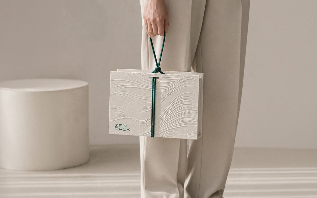
The Minimalist Exterior
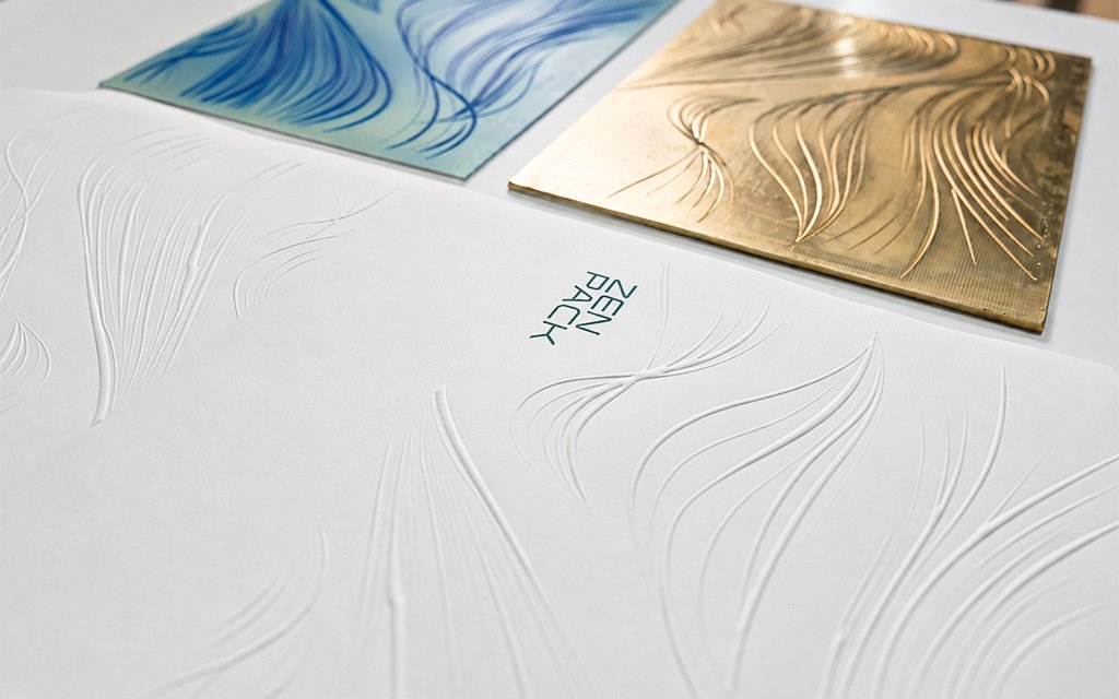
Flowing lines are embossed directly into warm-white paper without heavy ink, using line and shadow to represent the quiet, subtle paths our relationships take over time.
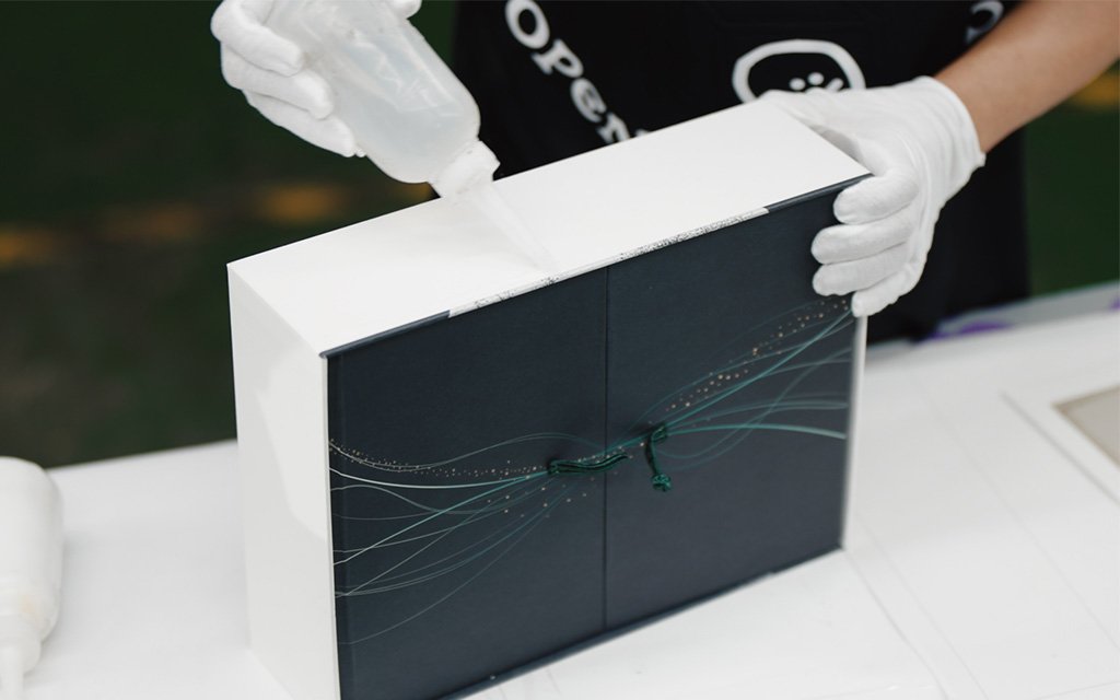
The Transpacific Convergence
On the left and right wing panels, the embossed lines shift from white to Zenpack green as they meet at a central Chinese knot. These two wings represent our teams in Taiwan and the US drawing together across the Pacific, bound by a shared identity and company culture.
The Night Reveal
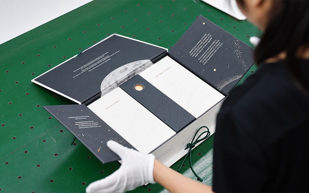
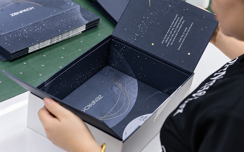
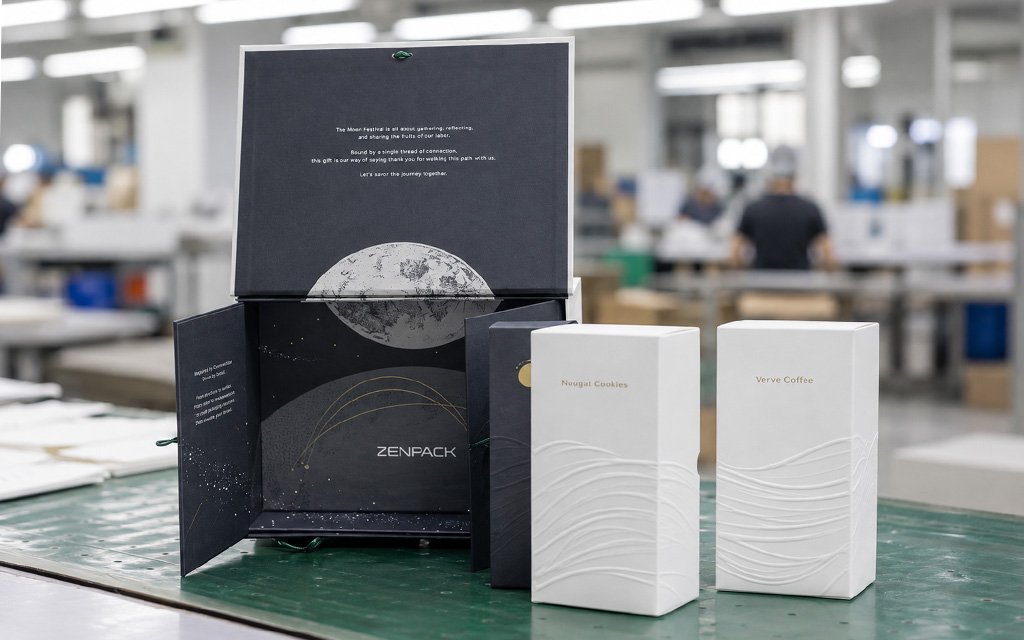
Unfolding the wings reveals a rich, dark moonscape filled with stars, moon phases, and subtle gold accents. The full moon isn’t visible all at once; it only resolves into a complete image as you remove the contents, mirroring how relationships become whole through active participation.
Reaching for the Moon
At the center sits a small gold finger hole used to lift the inner box. Stamped with the words “Reach for the moon,” it turns a functional utility into an emotional interaction, reaching into the box becomes reaching for the moon.
Every element in this initial phase was engineered to do two jobs at once: one practical, one emotional.
Phase 2: Structural Prototyping
Choreographing the Storyline
We didn’t want recipients to simply tear open a box; we engineered the unboxing flow to unfold like a four-beat play:
- The First Touch: Untie the deep-green wax cord wrapped around the outer shell.
- The Transpacific Convergence: Lift the lid to reveal the closed wing panels, where the embossed lines shift from white to green, bound by the central Chinese knot.
- The Reveal: Untie the knot by hand. The flaps swing open outward to reveal the coffee, nougat cookies, and the central black box with its gold moon.
- The Complete Moonscape: As the contents are removed, the fragments of stars and moon phases beneath finally resolve into one complete, continuous night scene.
Material & Cord Selection
To keep the hand-feel consistent from the outside in, we built the entire box using the same high-quality uncoated paper. Its raw fiber texture retains a soft, tactile warmth that heavily coated paper loses. Rather than layering different materials, we let one paper do all the work, using blind embossing for the exterior lines and dark inks with gold foil for the interior night sky, reducing composite waste while maintaining a unified feel.
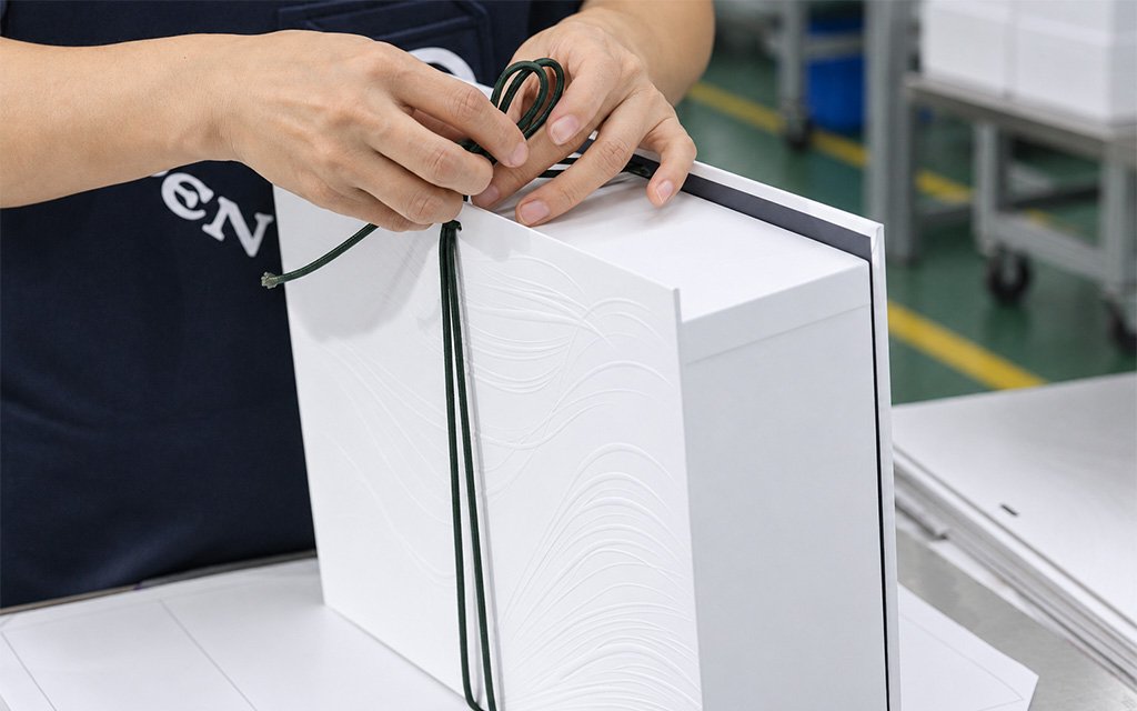
For the outer handle, we selected a deep-green wax cord that does three jobs at once: handle, fastener, and tactile anchor. Wax cord provides the exact body and resilience needed to support the box’s weight without stretching, while holding a crisp, clean knot shape through repeated tying and untying.
The Iteration: Turning a Finger Hole into the Moon
The central black box needed a way to be lifted out. Our earliest iteration relied on multiple small filler boxes, but it felt cluttered and over-engineered. We simplified the layout to a single central box, but Version 3’s plain circular finger hole looked visually jarring against the night scene.
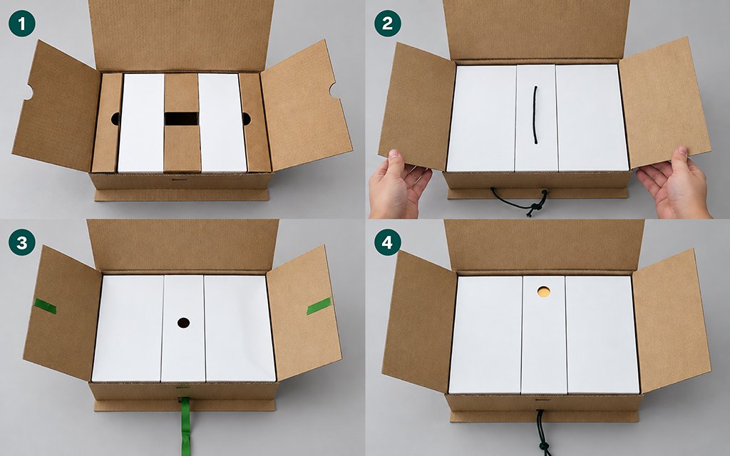
During testing, we had a breakthrough: turn the structural cutout into a gold-foiled moon paired with the words “Reach for the moon.” Pulling up the functional box instantly became a poetic interaction: reaching into the packaging became reaching for the moon. We weren’t adding decoration on top of a function; we found the version of a structural necessity that could also carry the story.
Phase 3: Three Engineering Breakthroughs
Many designs fail when you scale a handcrafted prototype to thousands of units in a factory. Our production team had to solve three physical engineering hurdles to get this PR box off the drawing board and onto the assembly line:
1. Embossing Without Tearing
Uncoated paper fights back when embossed deeply. If pushed too hard the fibers may rupture. To achieve deep, flowing lines without a single tear, the team fine-tuned every step of the process:
Die & Fiber Reinforcement: We paired thick, custom-engraved copper plates with a specialized resin mold. To keep the raised profile from flattening over time, we backed the thin face paper with a 200gsm double-coated paperboard.
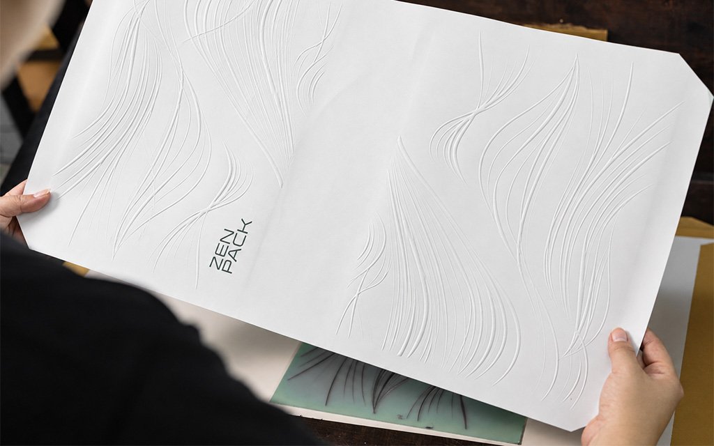
Thermal Calibration: We heated the stamping machine to exactly 55°C and applied dedicated cushioning tape under the die to distribute pressure evenly without tearing the paper fibers.
Hinge Flexibility: To keep the wing panels from cracking after repeated open-and-close movements, we removed the continuous greyboard at the joint creases, leaving only a face-paper-to-face-paper lamination so the hinges flex smoothly.
2. The Unbreakable Chinese Knot
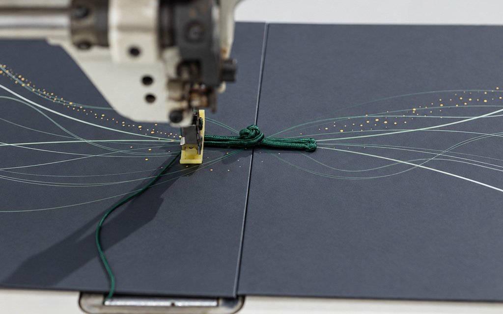
The central Chinese knot is the emotional anchor of the unboxing experience, meaning it must withstand repeated pulling. Gluing failed almost immediately; the cord’s curved surface offered too little contact area for adhesive, causing the paper to rip under stress.
Borrowing a technique from traditional Chinese clothing button construction, we stitched the toggle loop directly onto the wing panels. Using color-matched thread, workers double-passed a single stitch path to lock it in permanently before threading and securing the matching knot bead. The knot can now be fastened and unfastened endlessly without ever pulling loose or damaging the paper.
3. Millimeter-Level Alignment
Because our starry night graphic spans separate structural surfaces—the folding wing panels and the inner box base—any tolerance error larger than a fraction of a millimeter would make the complete moonscape look crooked and disjointed.
To guarantee zero-error alignment across assembly lines, we implemented a strict physical jig system:
- Microscopic Registration Lines: Alignment guides were printed directly onto the reverse side of the backing paper, base box, and U-shaped board.
- L-Corner Positioning Jigs: Assembly workers used physical L-corner jigs to center the backing paper perfectly when gluing it to the outer shell.
- Pre-Matching Checks: Before inserting the U-shaped boards, workers pre-matched the graphics across panels; any components with minor alignment deviations were filtered out before final assembly.
Phase 4: Factory Assembly & Craftsmanship
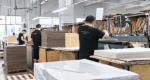
Below, watch our production team bring these complex components together on the factory floor.
Even with precise machinery, a luxury box requires a human touch. The wax cords on the exterior must be tied with a very specific tension. If the knot is too loose, the box slips; if it is too tight, it is frustrating to untie.
Our factory artisans developed a standardized horizontal pulling technique to ensure every box feels identical:
- The artisan folds a 2-meter wax cord in half and threads it through both ends of the box.
- They ensure the knotting side is slightly longer than the other end, as it must double as a finger pull.
- When tying the flat knot, they loop the cord over two fingers, pass it through the buckle, and pull their hands parallel and outward with equal force. This guarantees the knot is perfectly centered and tight.
- Finally, they apply a double-knot method to make sure the handle is sturdy enough for transport without slipping
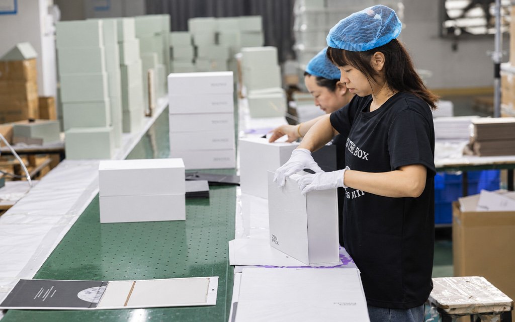
Quality control on this box extended beyond standard dimensions and defect checks. Because the experience is inherently tactile, QC standards focused on the unboxing feel itself. Operators used film-based registration jigs to catch line drift, checked embossing depth through side-light visual inspection and hand-touch, and evaluated every finished unit from the recipient’s perspective rather than a generic factory checklist.
Phase 5: The Final Experience & Beyond
When the recipient receives the Zenpack PR Box, they are holding a complete story of high-end design and engineering collaboration. From the crisp feel of the uncoated paper to the satisfying sliding tension of the wax cord, every single touchpoint has been optimized.
And the story doesn’t end when the cookies and coffee are gone.
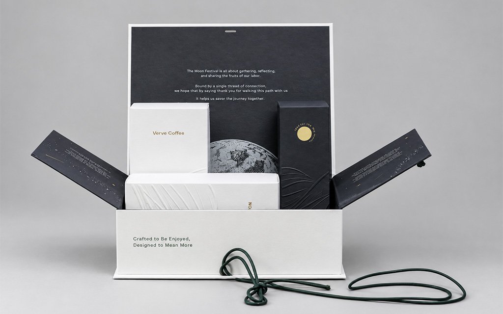
We designed this box with a “second life” in mind. Because we used a highly robust, rigid greyboard frame and high-grade papers, the box is incredibly durable. Once empty, the interior reveals a stunning, continuous starry night sky. Rather than being thrown away, the box elegantly transitions into a premium desktop organizer, document tray, or keepsake chest.
By creating a beautiful, functional object that recipients want to keep on their desks forever, we’ve designed a gift that is truly sustainable: keeping our brand, and your connection alive for years to come.
Ready to bring your next packaging story to life?
Let’s build it together. Contact the Zenpack team to start your packaging journey.
The post How We Designed, Engineered, and Produced Our Mid-Autumn PR Box appeared first on Zenpack Blog.