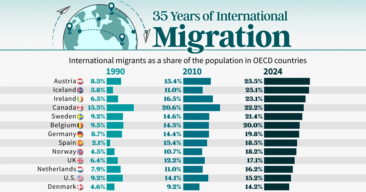
Charted: 35 Years of International Migration
See visuals like this from many other data creators on our Voronoi app. Download it for free on iOS or Android and discover incredible data-driven charts from a variety of trusted sources.
Key Takeaways
- Global migration more than doubled since 1990, reflecting growing international mobility.
- Out of OECD countries, Switzerland has the largest share of migrants at 31.1%. This is more than a 12 percentage point increase compared to 1990.
International migration has expanded at a remarkable pace over the past 35 years. As economies globalized and mobility increased, more people moved across borders for work, safety, and education.
This chart tracks how the share of foreign-born residents has changed across advanced economies since 1990. The data for this visualization comes from the United Nations.
Countries With the Highest Migrant Shares
Switzerland, Australia, and New Zealand show some of the highest migration shares among advanced economies.
Each has seen steady increases since 1990, driven by strong labor demand and open migration channels. Smaller economies like Iceland and Austria also experienced rapid growth, transforming their demographic landscapes. These countries have become some of the most internationally diverse populations in the world.
International migrants as a share of population, in OECD countries
| Country | 1990 | 2010 | 2024 |
|---|---|---|---|
 Switzerland Switzerland |
18.7% | 26.2% | 31.1% |
 Australia Australia |
23.3% | 26.6% | 30.4% |
 New Zealand New Zealand |
15.5% | 22.0% | 28.2% |
 Austria Austria |
8.3% | 15.4% | 25.5% |
 Iceland Iceland |
3.8% | 11.0% | 25.1% |
 Ireland Ireland |
6.5% | 16.5% | 23.1% |
 Canada Canada |
15.3% | 20.6% | 22.2% |
 Sweden Sweden |
9.2% | 14.6% | 21.4% |
 Belgium Belgium |
9.5% | 14.3% | 20.0% |
 Germany Germany |
8.7% | 14.4% | 19.8% |
 Spain Spain |
2.1% | 13.4% | 18.5% |
 Norway Norway |
4.5% | 10.7% | 18.2% |
 UK UK |
6.4% | 12.2% | 17.1% |
 Netherlands Netherlands |
7.9% | 11.0% | 16.2% |
 U.S. U.S. |
9.2% | 14.1% | 15.2% |
 Denmark Denmark |
4.6% | 9.2% | 14.2% |
 Greece Greece |
6.0% | 11.9% | 14.2% |
 France France |
10.3% | 11.5% | 13.8% |
 Italy Italy |
2.7% | 7.8% | 11.0% |
 Portugal Portugal |
4.4% | 7.2% | 10.8% |
 Czechia Czechia |
4.3% | 6.6% | 9.5% |
 Finland Finland |
1.3% | 4.3% | 9.2% |
 Türkiye Türkiye |
2.1% | 1.9% | 8.1% |
 Poland Poland |
3.0% | 1.7% | 4.5% |
 South Korea South Korea |
0.0% | 1.2% | 3.5% |
 Japan Japan |
0.9% | 1.7% | 2.8% |
 Mexico Mexico |
0.8% | 0.8% | 1.3% |
New Migration Hubs in Europe and Asia
Spain, Türkiye, and South Korea illustrate how quickly migration patterns can shift. Spain saw one of the steepest increases, rising from just 2% in 1990 to over 18% today. South Korea’s share climbed from near zero to 3.5%, reflecting its shift to a high-income economy attracting foreign workers. Türkiye’s rise underscores its growing role as both a destination and a transit hub for regional migration.
Traditional Destinations Still Lead in Absolute Numbers
Countries like the U.S., Germany, Canada, and the U.K. remain top global destinations based on total migrant populations. While their percentages have grown more gradually, their large base populations make them central to global migration flows. These economies continue to rely on international labor to fill workforce gaps and support long-term demographic stability.
Learn More on the Voronoi App 
If you enjoyed today’s post, check out Total Fertility Rates By Country on Voronoi, the new app from Visual Capitalist.
- Source: https://www.visualcapitalist.com/ranked-countries-seeing-the-fastest-growth-in-migrant-populations/