Visualizing 75 Years of U.S. Energy Production
See visuals like this from many other data creators on our Voronoi app. Download it for free on iOS or Android and discover incredible data-driven charts from a variety of trusted sources.
Key Takeaways
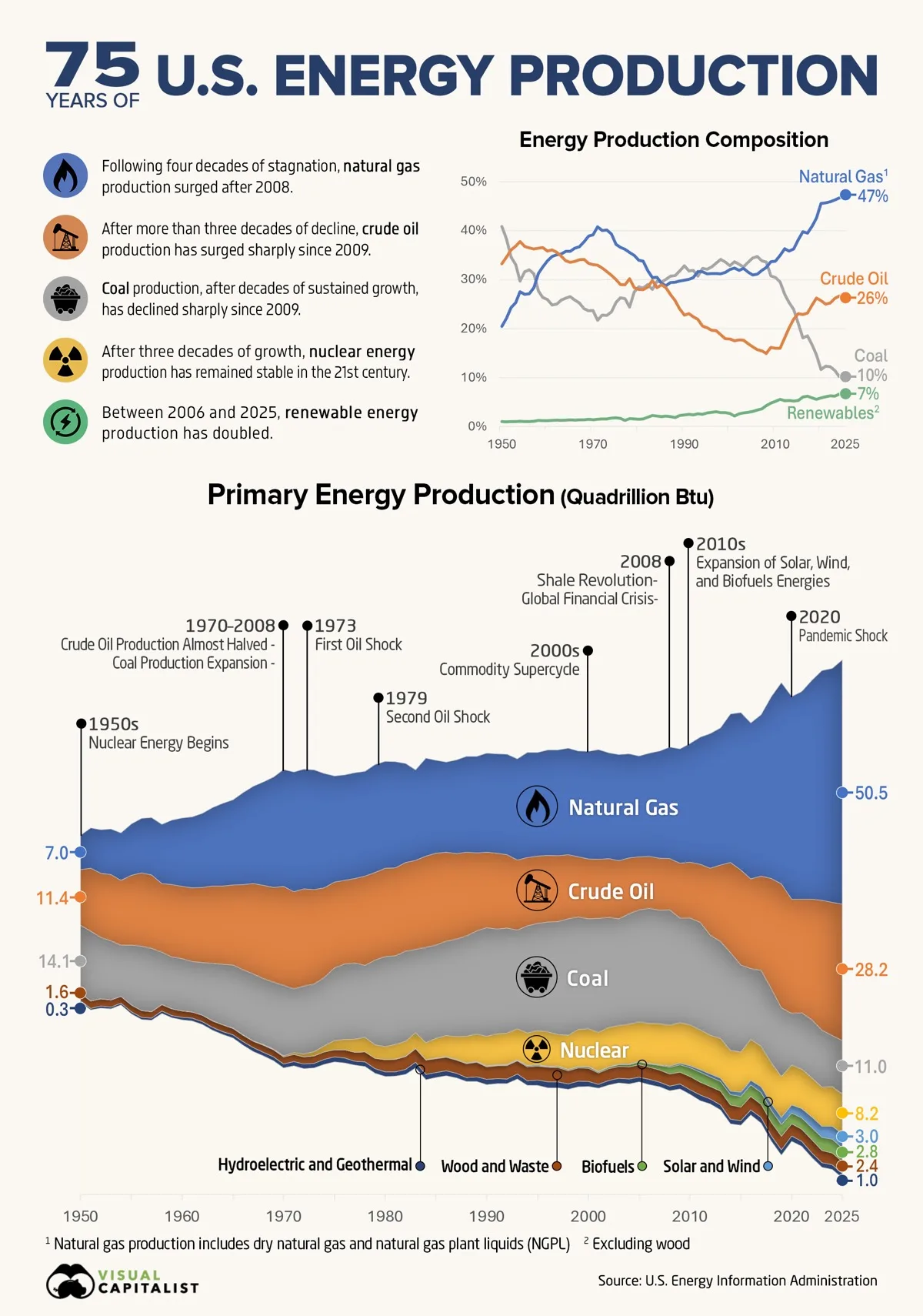
- Coal and natural gas have swapped places since 1950. Coal fell from 41% of U.S. energy production to 10%, while natural gas rose from 20% to 47%.
- Crude oil ranked second in both 1950 and 2025, despite falling from nearly 40% of production in the early 1970s to just 15% in 2008.
- Total U.S. primary energy production more than tripled over the period, rising from 34.5 to 107.1 quadrillion BTU.
Over the last 75 years, the sources powering U.S. energy production have changed significantly, shaped by new technologies, shifting economics, and major global events.
This visualization tracks the production share and total output of major U.S. energy sources from 1950 to 2025.
Energy production is measured in quadrillion British thermal units (quads). The figures come from the U.S. Energy Information Administration.
75 Years of U.S. Energy Production (1950–2025)
U.S. primary energy production climbed from 34.5 quadrillion BTU in 1950 to 107.1 quadrillion BTU in 2025.
Natural gas accounted for much of that growth, rising from 7.0 to 50.5 quads, an increase of more than sevenfold. Most of the gain came after 2008, when shale drilling ended a four-decade stretch of largely stagnant output.
The data table below shows U.S. energy production by source from 1950 to 2025, measured in quads:
| Energy Source | 1950 (Quads) | 2025 (Quads) | % Change (1950–2025) |
|---|---|---|---|
| Coal | 14.1 | 11.0 | -22.0% |
| Natural Gas | 7.0 | 50.5 | 621.4% |
| Crude Oil | 11.4 | 28.2 | 147.4% |
| Nuclear | 0.0 | 8.2 | n/a |
| Hydroelectric and Geothermal | 0.3 | 1.0 | 233.3% |
| Solar and Wind | 0.0 | 3.0 | n/a |
| Wood and Waste | 1.6 | 2.4 | 50.0% |
| Biofuels and Waste | 0.0 | 2.8 | n/a |
| Total U.S. Primary Energy Production | 34.5 | 107.1 | 210.4% |
Coal moved in the opposite direction. Production rose from 14.1 quads in 1950 to a peak of 24.0 quads in 1998, before falling sharply after 2009 as utilities increasingly switched to lower-cost natural gas. By 2025, coal production had declined to 11.0 quads.
Crude oil followed a longer and more volatile path. Production nearly doubled from 11.4 quads in 1950 to 20.4 quads in 1970, then declined for more than three decades to a low of 10.6 quads in 2008.
The same shale techniques that revived natural gas production also pushed crude oil output to a record 28.2 quads in 2025, helping make the U.S. the world’s largest oil producer.
Coal and Natural Gas Have Swapped Places
In 1950, coal was the largest source of U.S. primary energy production, followed by crude oil and natural gas. By 2025, natural gas had moved into first place, crude oil remained second, and coal had fallen to third.
The data table below shows each major energy source’s share of U.S. production in 1950 and 2025:
| Energy Source | 1950 (Share of Energy Mix) |
2025 (Share of Energy Mix) |
Percentage Point Change (1950–2025) |
|---|---|---|---|
| Coal | 40.9% | 10.3% | -30.6 |
| Natural Gas | 20.3% | 47.2% | +26.9 |
| Crude Oil | 33.0% | 26.3% | -6.7 |
| Nuclear | 0.0% | 7.7% | +7.7 |
| Hydroelectric and Geothermal | 0.9% | 0.9% | +0.1 |
| Solar and Wind | 0.0% | 2.8% | +2.8 |
| Wood and Waste | 4.6% | 2.2% | -2.4 |
| Biofuels and Waste | 0.0% | 2.6% | +2.6 |
Crude oil is the one major fuel that ended close to where it began. It supplied 33% of U.S. production in 1950 and 26% in 2025, ranking second in both years. In between, its share rose to nearly 40% in the early 1970s before falling to just 15% by 2008 amid a multidecade production decline.
The shale-driven rebound in oil and natural gas has helped keep the U.S. among a small group of major economies that produce more energy than they consume, alongside countries such as Russia, Saudi Arabia, and Canada.
Renewable sources have also expanded from a relatively small base. Solar, wind, hydroelectric, and biofuels collectively increased their share of U.S. production from 3.4% in 2006 to 6.7% in 2025. Even so, the country’s production mix remains dominated by the same three fossil fuels as in 1950, only in a different order.
Learn More on the Voronoi App 
If you enjoyed today’s post, check out Mapped: The World’s Biggest Energy Sources by Country on Voronoi.