Why the UN Wants a Different World Map
Key Takeaways
- On Sept. 4, 2026, the UN General Assembly adopted the “Correct the Map” resolution by a 164-1 vote, endorsing the Equal Earth projection.
- The non-binding resolution encourages governments, schools, media, international organizations, and technology platforms to use equal-area maps when comparing the sizes of continents.
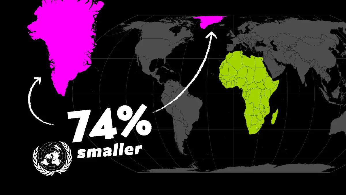
- Unlike Mercator, Equal Earth preserves the true relative size of landmasses, dramatically changing how places such as Greenland, Canada, and Africa appear beside one another.
For more than four centuries, the Mercator projection has shaped one of the world’s most familiar views of the planet.
The icon map was designed to make navigation on the Earth’s oceans easier, but it came with a cost: the farther a place lies from the equator, the more dramatically its size is exaggerated.
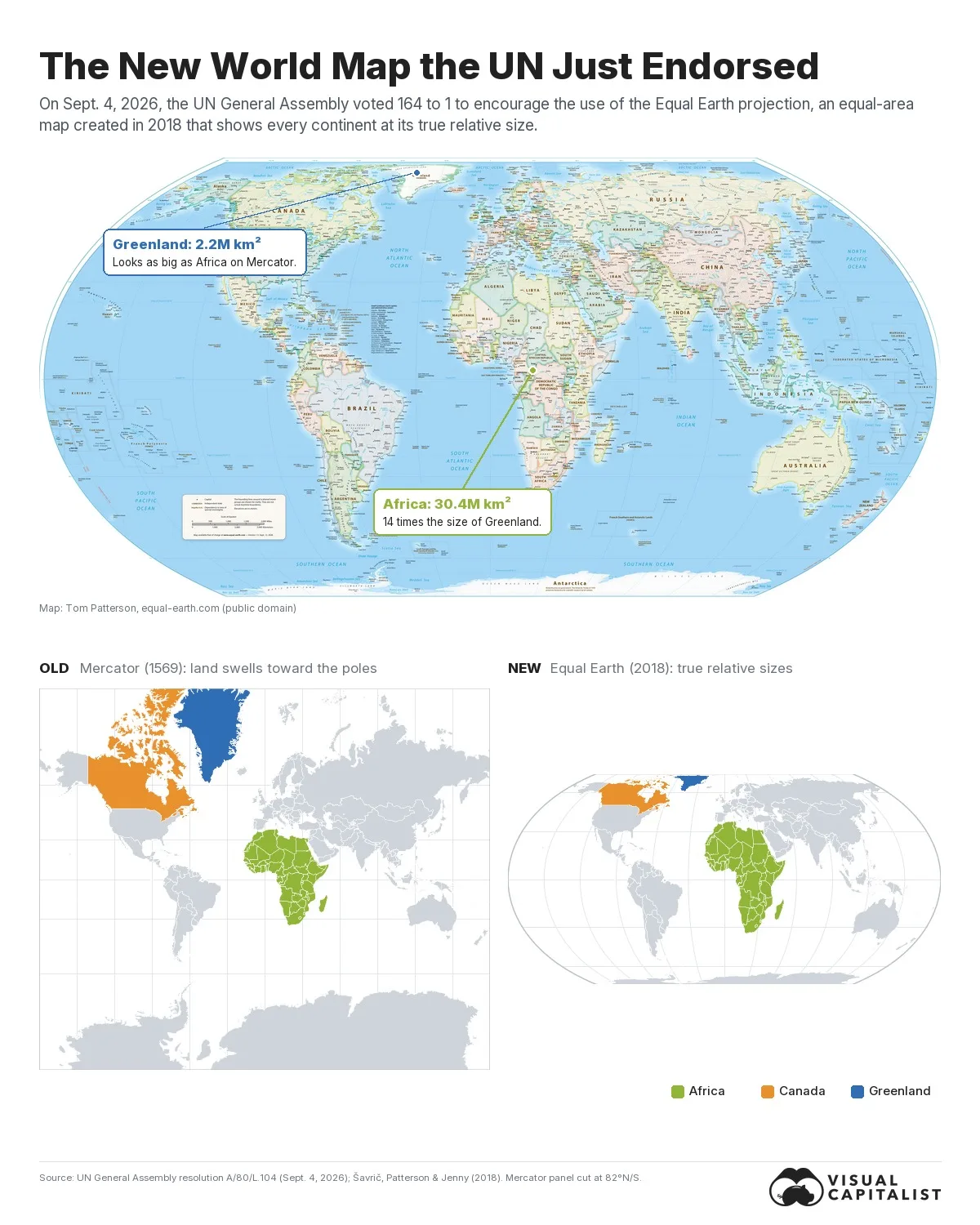
On Sept. 4, 2026, the United Nations General Assembly endorsed the Equal Earth projection, an equal-area world map published in 2018, and encouraged governments, schools, media, and technology platforms to use it wherever the comparative size of continents matters.
The graphic above shows that map, using the free Equal Earth wall map published by cartographer Tom Patterson, one of the projection’s three creators, with vote details from UN resolution A/80/L.104 and the UN’s meetings coverage.
The Old Map vs. the New Map
Every flat map has to give something up, and the two below make different trade-offs.
Mercator, on top, keeps compass bearings straight and pays for it in area, stretching land more as it approaches the poles. Equal Earth, beneath it, keeps area exact and lets shapes bend slightly instead. Africa, Canada, and Greenland are highlighted on both so you can see what happens to each when the projection changes.
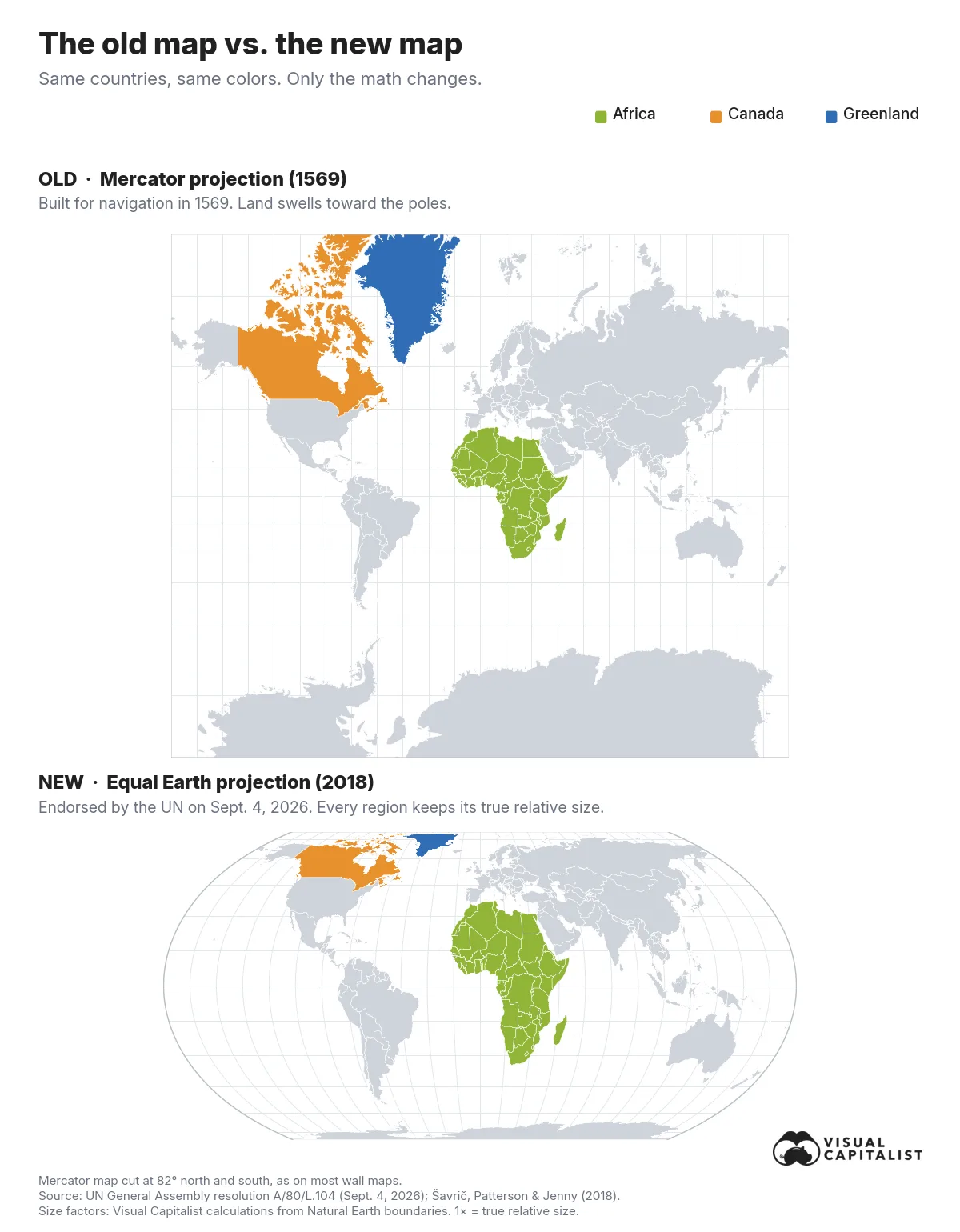
Gerardus Mercator designed his map in 1569 for sailors. A straight line on it follows a constant compass bearing, which made it indispensable at sea and, much later, useful for seamless online maps.
The trade-off is that it stretches the world more and more as you move away from the equator. At 60° north, roughly the latitude of Oslo or Anchorage, land is drawn four times too large. At 80° north, it is drawn 33 times too large.
Equal Earth was created in 2018 by Bojan Šavrič of Esri, Tom Patterson of the U.S. National Park Service, and Bernhard Jenny of Monash University, and published in the International Journal of Geographical Information Science.
Equal Earth keeps sizes exact while borrowing the rounded outline of the popular Robinson projection, which is why it looks familiar even though the proportions are different.
How Sizes Change in Different Map Projections
The clearest way to see the difference is to lift three landmasses off the map and place them next to one another at the same scale.
The biggest surprise is not how much Africa grows, but how much Canada and Greenland shrink. Because Africa straddles the equator, Mercator already shows it close to its true scale, while northern landmasses are dramatically enlarged.
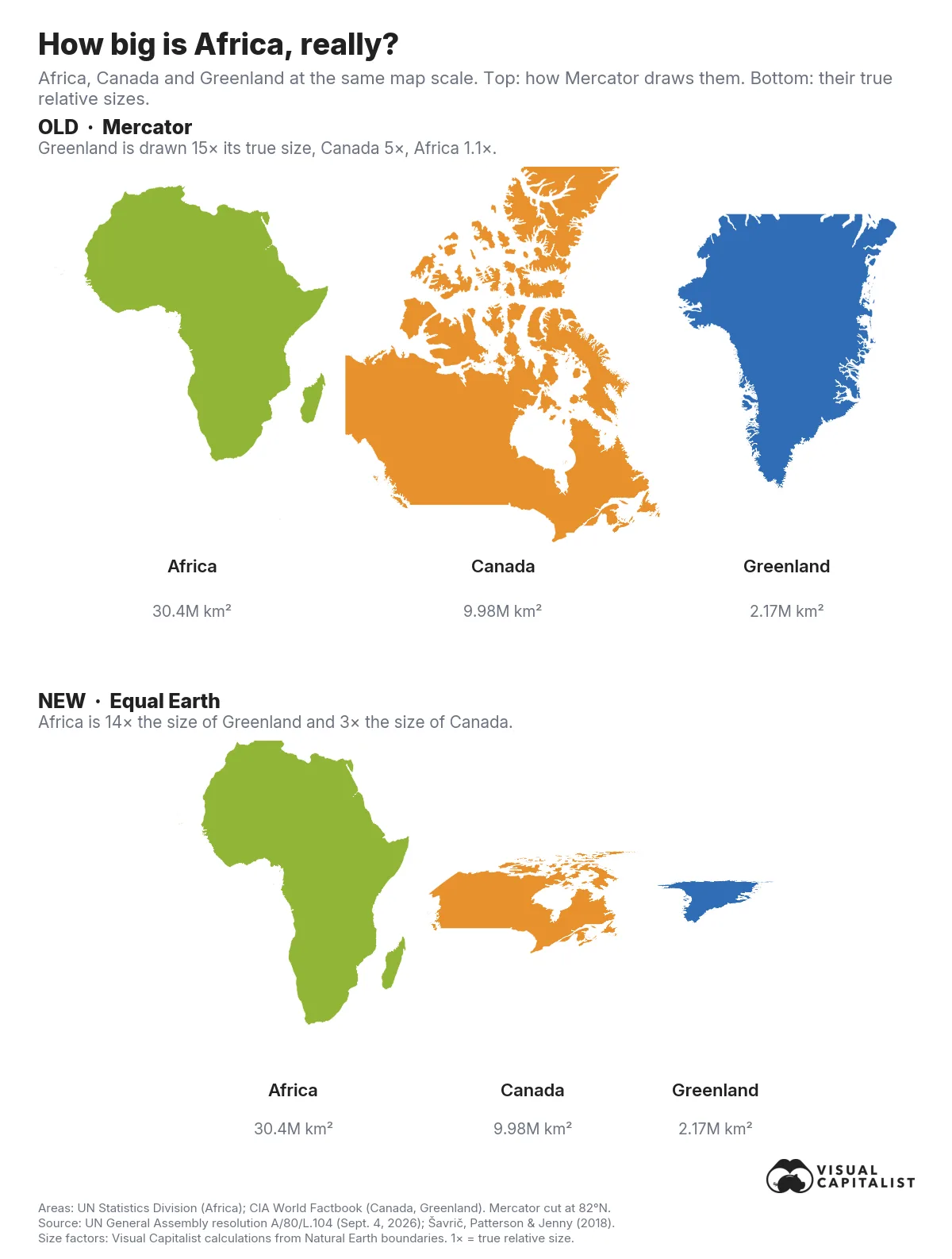
Mercator does not shrink Africa. The continent is drawn at roughly 1.1 times its true size, close to exact. Instead, Mercator inflates land farther north, making Africa look smaller by comparison.
Drawn at the same scale, Africa covers about 30.4 million square kilometers, Canada just under 10 million, and Greenland 2.17 million. On Equal Earth, all three appear at their real proportions: Africa is 14 times the size of Greenland and three times the size of Canada.
On Mercator, Canada appears about 50% larger than Africa even though it is only one-third the size, while Greenland appears nearly as large as the continent.
The UN’s Own Map Isn’t Mercator Either
There is one wrinkle in the UN’s push to replace Mercator: Mercator is not the projection used on the UN’s own world map.
Its official Map of the World, shown first below, uses the Robinson projection, a rounded compromise designed to look visually balanced rather than preserve exact area. Beneath it is the Equal Earth map the General Assembly just endorsed, drawn at the same width so the two can be compared directly.
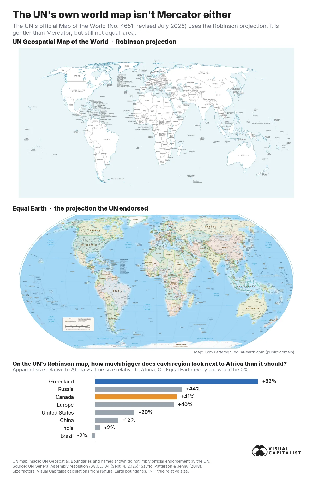
The UN’s own guidance says most of its world maps use Robinson, Winkel Tripel, or Eckert IV projections.
Robinson is far gentler than Mercator, but it is not equal-area. By our calculation, the UN’s map draws Greenland at about 1.5 times its true size and Canada and Russia at about 1.2 times, while Africa comes in at 0.85 times.
Relative to Africa, Canada and Russia look roughly 40% larger than they should, while Greenland looks more than 80% larger.
What Changes Now After the UN’s Vote?
The “Correct the Map” resolution, introduced by Togo for the African Group, passed 164-1 with six abstentions. The United States cast the only “no” vote, calling it a “radical ideological project,” while Estonia, Georgia, Lithuania, Moldova, Serbia, and Ukraine abstained.
The text is non-binding. It does not ban Mercator or affect navigation charts, but it declares Equal Earth the more accurate representation of continental sizes and urges governments, schools, international organizations, and “global technology platforms” to adopt it.
Web maps are unlikely to change soon, since Google Maps, Apple Maps, and most online maps are built on Web Mercator because it tiles neatly at every zoom level. The vote will likely matter most in classrooms, textbooks, and newsrooms, which is exactly where the “Correct the Map” campaign, backed by the African Union, wants to see change.
The African Union has already adopted Equal Earth, France has said it will drop Mercator from official communications, and Togo plans to update its textbooks and convene UNESCO, the AU, and technology companies in early 2027.
As Togo’s foreign minister Robert Dussey told the assembly, “A fair map does not change the geography of the world, it changes how we see it.”
Learn More on the Voronoi App
If you enjoyed today’s post, check out How Many Countries Fit in Africa on Voronoi.